Data visualization is the graphic representation of information and data. Visualization tools have become indispensable for analyzing large volumes of information, particularly about the external environment, and making decisions based on factual data. However, relevant, reliable and up-to-date data are needed to provide decision-makers with an accurate and useful picture. Discover how an interactive dashboard can help you analyze your environment.

Numerous technologies and intuitive software programs facilitate this task of analysis and decision-making, based on factual data. Using visual elements such as graphs and maps, data visualization tools make it easy to see and understand trends or unusual values in the data. However, visual representation is often focused on internal data, and visualization of the external environment is still largely under-exploited, often due to a lack of structured, reliable data. So it’s by working on data quality that companies can build a powerful strategic decision-making tool.
DECOUVREZ DANS CET ARTICLE
Which perimeter to view? internal or external data?
Common quantitative information measured by companies is most often internal data: units or products sold, revenues by quarter, expenses by department, employee statistics, etc… The focus is often on performance metrics, data dashboards and key performance indicators (KPIs).
Yet the visualization of external data relating to the company’s environment is still largely under-exploited, even in large companies. The main reason for this is that external data is often poorly structured and therefore not suitable for quantitative analysis.
The most common visualizations of external data are those relating to customers and markets (data generally derived from internal processing) or engagement on social media (the analysis is often limited to the company’s own accounts and not to its competitors and other market players).
What types of data: raw data or qualified data?
There are 2 types of external data that can be processed and visualized:
Raw, structured data from reliable sourceshave the advantage of being objective and concrete. This data can come from scraping (automated extraction of data from the web) or from external APIs (social media, web traffic, market data services, etc.). Dataviz makes it possible to harness large volumes of data and put them to practical use, thanks in particular to near-real-time, dynamic analysis. However, the biases included in the datasets are also present in the visualization.
Qualitative data, validated, “digested” and contextualized by an analyst. The human filter can bias the analysis of a situation, through the selection of this or that information, choices of categorization, evaluation and associated metadata. On the other hand, the quality of the information is more relevant to the company, precisely because of the selection and qualification work involved. Viewing this information enables us to analyze a specific situation from the company’s point of view. For example, the graphic representation of scenarios, according to their economic impact (positive or negative) and their probability of ocurrence, makes it easier to prioritize and share points of view with different teams, thus building a shared vision of the situation.
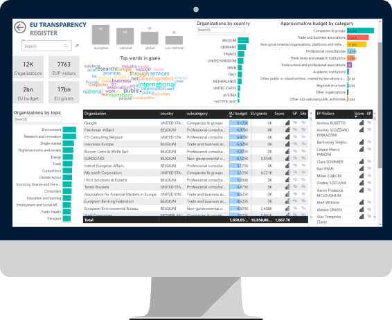  |
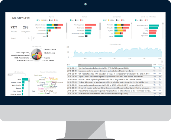  |
|
| Visualizing raw data
European Influencers |
Qualified data visualization
Captured information |
The difficulties of visualization: a powerful but subtle analysis tool
Multi-criteria data visualization can also be used to detect anomalies and errors, or, on the contrary, more easily detectable “surprises”. The quality of the data is therefore fundamental to any relevant analysis. Data is always associated with a data provider, who structures the information to make it usable. It is therefore very important to check upstream the quality of this data, its timeliness, level of precision and the primary source of each element. It’s also important to understand how data is generated, to avoid analysis errors. For example, how can we analyze communication on social networks when we know that many messages, comments and interactions are generated by programmed bots or trolls (whose behavior is aimed at creating false polemics)? Filtering certain content and categorizing social accounts provides a less “raw”, and therefore more relevant, analysis.
Choice of display modes
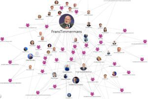
There are hundreds of types of graphical representation, from the simplest to the most complex. As a general rule, it’s best to start with simplicity, but above all to choose representations adapted to what you want to highlight. For example, surfaces or pie charts can be used to represent market share or structure, or to compare volumes at a given time or over a given period. Select temporal or chronological views to highlight trends. We opt for a word cloud (based on their occurrence) to give an idea of the content of a documentary corpus. To visualize a geographical distribution, use one of the spatial maps. To understand relationships between entities, such as influencers on social media or mergers and acquisitions in industry, relational mapping is highly appropriate.
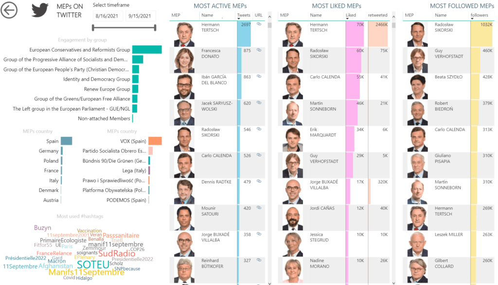  |
  |
|
| Ranking players by performance
Members of the European Parliament on Twitter by activity, likes and followers |
Mapping relationships between players
Official meetings of registered influencers with European public decision-makers |
Integration into work processes
Visualizations only make sense if they are understood by users, which implies well-documented indicators, definitions, analysis criteria and data sources. In addition, analyses must be targeted to their specific environment. The scope of analysis must therefore be adapted to each user group, according to its particular needs (market, geography, period, etc.). For greater efficiency, it is also preferable to integrate the right visualizations into existing work tools, so that they can be used when users need them: intranet, CRM, collaborative tools…
Since 2007, HUMIND has been helping companies monitor their strategic environment by delivering targeted reports on their markets and issues. Find out how HUMIND can help you visualize reliable, up-to-date key data to support your decision-making. Read more


